Workstream, 2024
Payroll
Our new payroll product line targeted employees, a group of users we had never built products for yet. How might we solve the unique pain points of these underserved users?
Role: End-to-end product design
Team: Product Manager, UX Researcher
Timeline: 3 months
Unlocking new revenue streams
Workstream was initially focused on making hiring software for managers at quick-service restaurants. But as hiring growth slowed in 2023, the company needed a more consistent revenue stream.
Payroll became an attractive option for achieving this, and quickly became our fastest growing product line, hitting $500k in ARR. However, the most common customer complaint was that we lacked a way for employees to manage their own payroll needs: and that meant creating a new product aimed at the employees themselves, not just their managers.
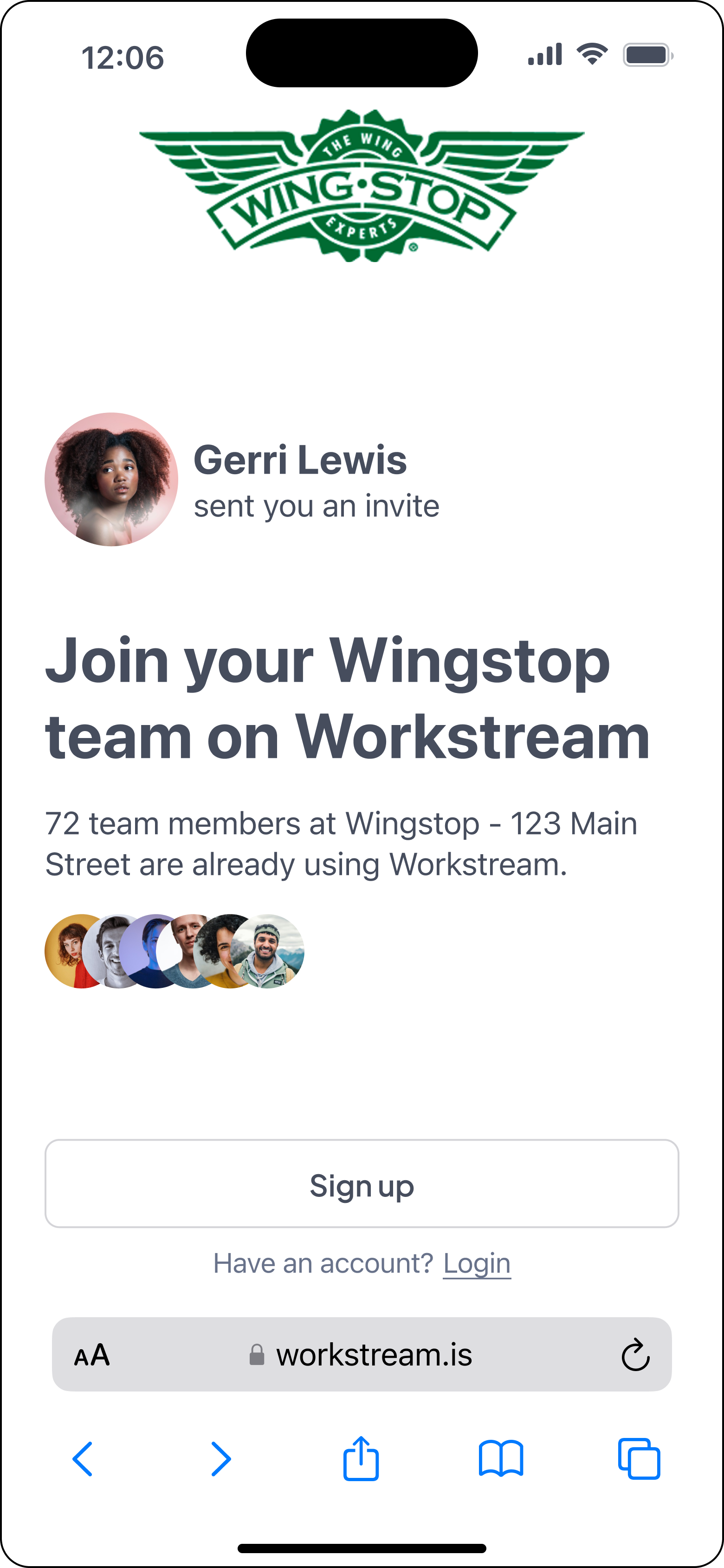
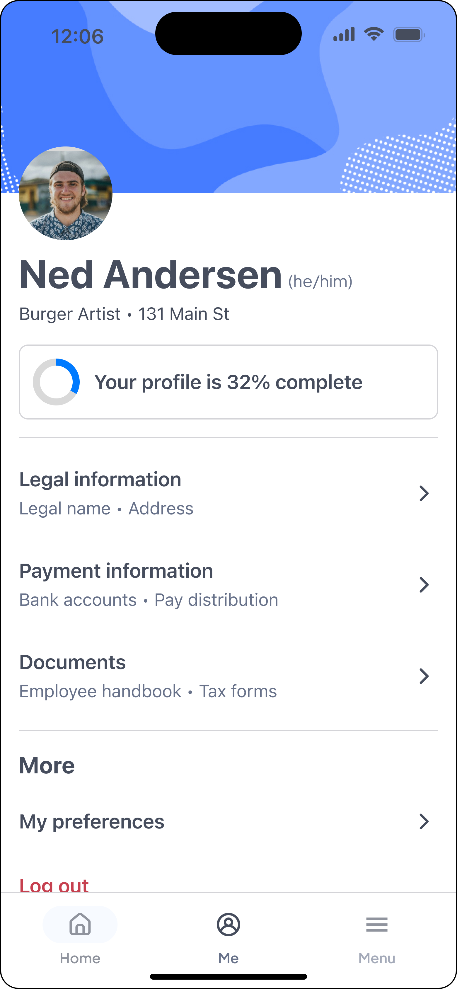
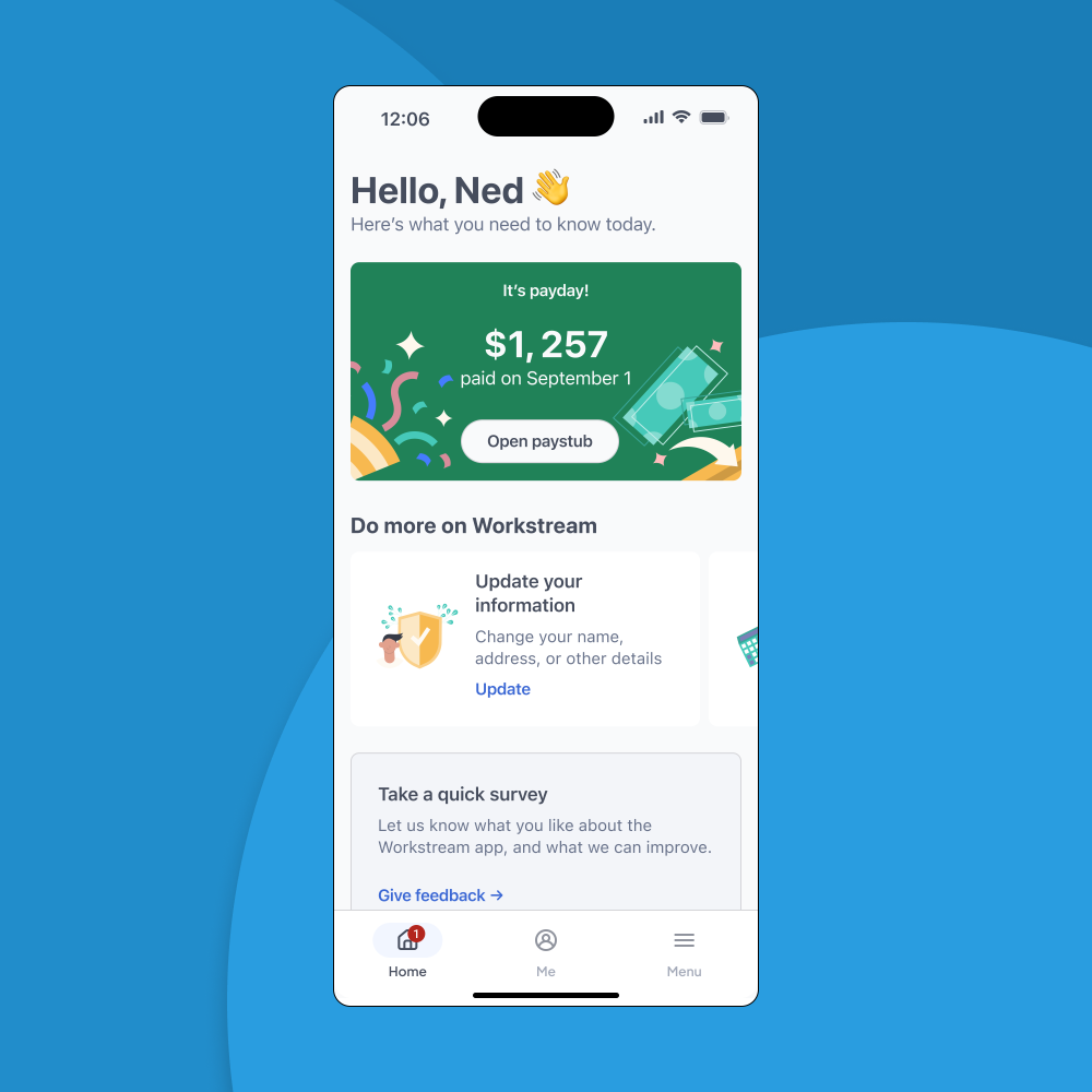
Final design as shipped on iOS.
Understanding this new user segment
Employees had little to no touchpoints with the Workstream system, so the company didn’t have any formal user personas aside from a general idea of what typical customers expected from an employee payroll portal.
I decided I needed to answer some key questions first:
Who are hourly workers? What is their work day like?
What is their relationship with their pay and finances?
Deciding my research methods
I decided to join another product designer who was working on a separate onboarding feature targeted at the same demographic. Together we worked with our Lead UX Researcher, who helped with our research plan and synthesis.
I started by conducting qualitative interviews with seven workers in the food service and hospitality industries, with the goal of building a foundational user persona for this demographic.
Learning about their immediate needs
A running theme was a focus on immediate, short-term needs. The nature of hourly work meant that employees often focused on short-term financial needs, lived paycheck to paycheck, and found it crucial to know exactly how much they got paid that cycle.
In contrast to more stable positions, their lack of long-term financial security also meant they frequently changed addresses, bank accounts, or worked multiple jobs – all of which had implications for the management of their payroll information.
In a similar way, their work needs are also a lot more immediate. The typical restaurant is chaotic is fast-paced, without any time to sit down at a computer in the back room.
Hourly workers are diverse
While I intended to produce one foundational persona document, it was clear that we could actually group the employee into two main personas. In the end, we created artifacts for both groups: the novice worker and the experienced worker.
Foundational user personas for the hourly worker, based on these interviews.
Iteration is a team effort
I drew a lot inspiration for my initial sketches and wireframes from some base-level competitive analysis: there were plenty of payroll and personal finance solutions to draw inspiration from.
But when it came to onboarding new users onto the complex, multi-step process of setting up their payroll for the first time, I wanted to involve the design team in a more collaborative activity. I led a Crazy 8’s session to look at different ways we could present these onboarding tasks to the user — and since this is quite a common pattern for many of our other products, I had the goal of establishing a general pattern that we could use elsewhere as well.
Whiteboarding with a remote team is challenging, but Figjam helps bridge the gap.
Beta program and initial validation
The fast-paced nature of this initiative meant that I wasn’t able to validate a lot of my initial assumptions before we started building the product. However, I worked with my PM to release our initial build as a beta version with a select group of customers, with the goal of collecting real-world data that we could use to iterate on before our launch.
In the end, we released our first build to a single customer with two locations, with a total of 15 employees. The plan was to gather feedback from the customer, while also including a lightweight feedback form in the app itself.
What we learned
A lot of my initial directions from the research were validated in the beta program.
One area of improvement I’ve identified is around the payday announcement and amount. From our interviews, we knew that payday and the paycheck amount are highly important to our users, who often live paycheck to paycheck. However, users in the beta program didn’t always view their paystub right away, or even at all.
Initial feedback from users on this is around what they need the information for. Often, users wanted to know how much their paycheck would be before it hits their bank account — that is, they would want to know how much money is coming up, so they can plan accordingly.
On top of that, we launched without paychecks connected to our notification system, due to time constraints.
Given both of these learnings, there is improvements we can make around the notification system and the timing of when we communicate the paystub information to the user.


