Case study
Granting permissions
Requesting permissions is a sensitive but critical step during user onboarding—so how might we encourage users to grant permissions?
Role: End-to-end product design, including usability research and prototyping
Team: Product Manager, iOS Tech Lead
Timeline: 1 month
Onboarding is critical
When first downloading Dialpad, the user encounters a series of confusing new-feature announcements and permissions requests.
Not only is this annoying, it contributes to the deeper user problem we needed to tackle: users were denying permissions that were critical to app functionality.
How might we generate trust?
Based off of that, I wanted to generate trust with users to grant critical permissions, while creating a seamless flow.
The three metrics I would measure in our goal would be:
Maintain iOS user growth
Increase iOS permissions granted
Increased qualitative sentiment in App Store reviews
Since this project also coincided with the first roll-out of our design system on mobile, we wanted to ensure that this utilized our design system as much as made sense.
*While this project encompassed both the iOS and Android apps, this case study was written to focus solely on iOS.

Final design as shipped on iOS.
Discovery
Our customers are desktop-centric
89% of core user activity — calls and SMS messages — take place in the desktop app, with the remaining 11% on Android and iOS. And all new customers can only onboard on the desktop.
This means that new mobile users are not new to Dialpad, they’re only new to the app. They see mobile onboarding as an interruption into their daily workflow.

Before the design intervention
Discovery
Different user licenses lead to different user flows
Before I got into wireframes, I spent a lot of time iterating with my design team and my cross-functional partners on a workflow that made sense. Engineering was particularly helpful in determining the logic for which permissions that different user licenses would need based on the feature set available to them. Product Management was critical to help me understand our business model and which features were critical to different users.
This logic tree was my first artifact that would guide us into building out our user flow and wireframes.

Ideation and testing
Too much interactivity was confusing
After generating some ideas in low-fidelity, we used usability testing to narrow down our options. The initial prototype had the explanation for each permission hidden behind a dropdown, and you could toggle which permissions you wanted before hitting the big blue button.
But in usability tests, participants found this “too interactive.” It was too annoying to read each one, and users got confused when they toggled something and still got a permissions request anyway.
A couple iterations later simplified the interactions and the button copy. This managed expectations better, since users now knew they hadn’t actually granted permissions yet. They also appreciated being asked for all the permissions in one go.

Solution
Design system
Taking advantage of our new design system allowed us to standardize color choices and font hierarchy that were previously left up to the designer to decide ad-hoc.
This also empowered me to create a replicable layout for each permission cell that could be reproduced throughout the flow and even in other parts of the app.

Solution
Accessibility
The design system also allowed me to create more accessible flows in this experience for low-vision users. Text is fully scalable to system level preferences, is compatible with on device screen readers, and colour contrast adheres to WCAG AAA guidelines.

Wrap-up
How we did
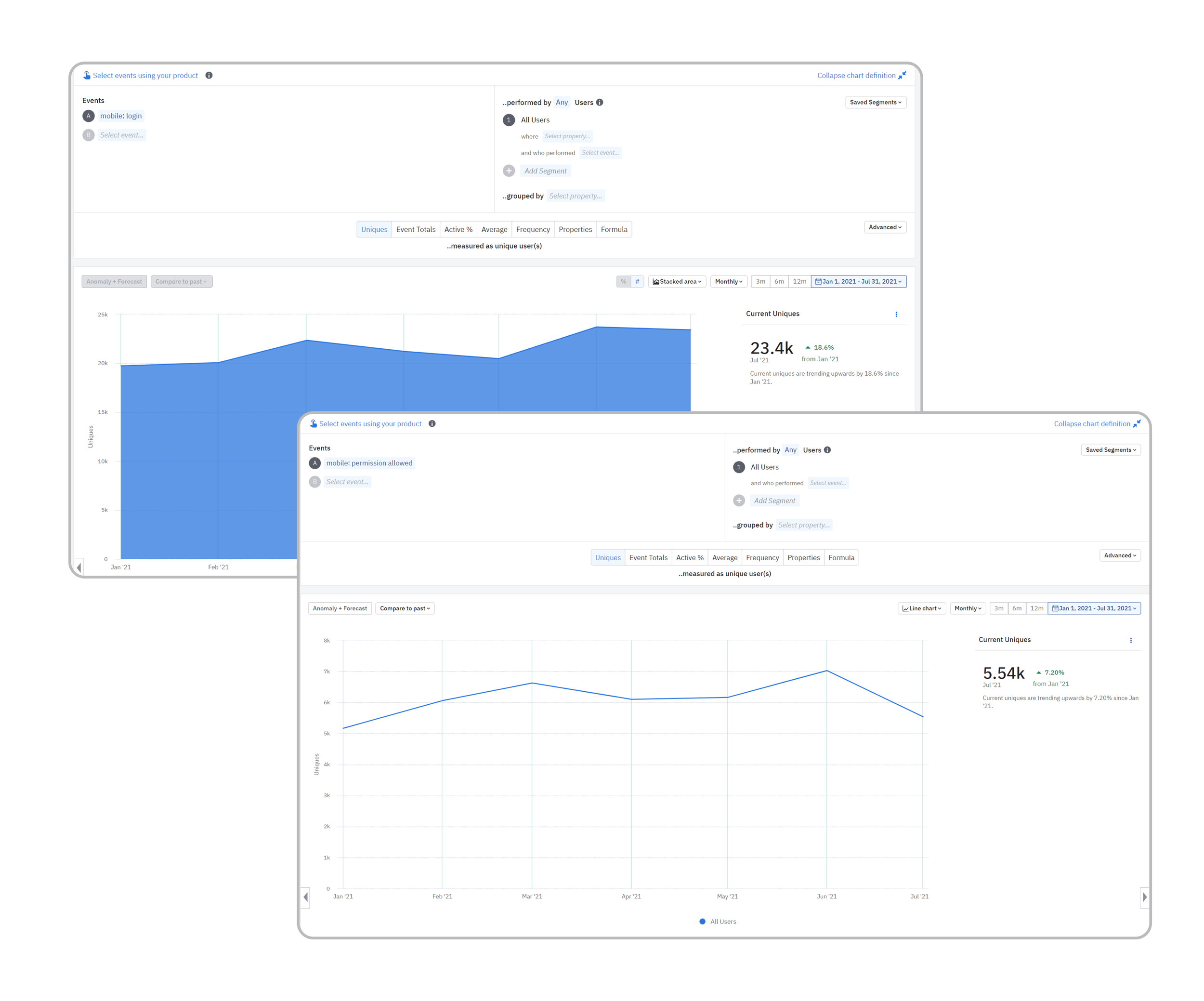
After launching this improvement at the end of Q1, we saw permissions granted increase on iOS from Q1 to Q2 by approximately 7.2%. (We also saw iOS users increase by 18.6% in that same period, but it is unclear whether that was also affected by the design intervention, or by exogenous factors like an increase in overall Dialpad users.)
We also saw qualitative feedback in App Store reviews that reinforced the goals of the project. Reviews contained quotes like “I was surprised by how easy it was to install and log in to the app,” or “Easy to set up and use.”
What I learned
I was in constant communication with engineering throughout this project. In the early workflow phase, it was essential to understand the tech and make decisions around which permissions we should deem optional or mandatory.
Likewise, during the development phase, my engineering team felt comfortable enough to continually show me their builds for feedback. Since this onboarding flow was so interaction heavy, I really worked to make sure everything worked as close to spec as possible, to make it as smooth as I intended.